

How weak trust signals, poor mobile design, and unclear next steps cost businesses good leads.
A website does not get much grace.
A visitor lands on a homepage from Google, Facebook, Yelp, LinkedIn, a referral link, or a QR code on a business card. They give the page a few seconds. Maybe less. In that small window, the visitor tries to answer a blunt question: “Am I in the right place?”
If the answer feels unclear, they leave.
For business owners, this is not just a design problem. It is a sales problem, a trust problem, and often a missed-lead problem hiding in plain sight. Visitors do not usually leave because they hate your business. They leave because the website does not help them fast enough.
Search behavior has changed, but the visitor’s basic instinct has not. People want clarity, confidence, and a path that feels easy to follow. If your site makes them squint, hunt, guess, or wait, the back button starts looking pretty good.
The Five-Second Test for Small Business Websites
The first reason visitors leave too early is simple: they cannot tell what you do within five seconds.
This sounds basic until you look at real websites. A local contractor in Akron says it provides “quality solutions for your property.” A consultant in Dallas says she helps companies “move forward with confidence.” A medical spa in Phoenix uses a giant lifestyle photo, a soft headline, and no clear mention of treatments until halfway down the page.
The visitor is left piecing things together like a detective with bad lighting.
A strong website should quickly tell people what the business offers, who it serves, where it works, and how to take the next step. That does not mean cramming everything into one giant headline. It means the page should orient people fast.
A clear headline might say, “Residential Roof Repair in Columbus, Ohio.” A subheading can add, “Fast inspections, storm damage help, and roof leak repairs from a local crew.” That is not fancy, but it works. The visitor knows where they are.
Too many business websites lead with personality before clarity. Personality is useful, but only after the visitor understands the offer. Confusion is not intrigue. It is friction with a nice sweater on.
Trust Breaks Before the First Phone Call
Visitors often leave because the website quietly makes them doubt the business.
Outdated design, broken images, thin content, missing contact details, weak testimonials, stock-photo overload, and sloppy formatting all create doubt. A visitor may not name each problem, but they feel the pileup. The page looks worn. The details feel unfinished. The company starts to seem less reliable.
The real issue is not beauty. It is confidence.
A visitor is asking, “Can I trust this company with my money, time, home, health, business, or project?”
That question sits underneath almost every visit. It applies to a plumber in Tampa, an attorney in Chicago, a wedding photographer in Nashville, and a software consultant in Seattle. The purchase may be different, but the risk calculation is similar.
Trust signals help settle the visitor. Real reviews. Clear contact information. Photos of actual staff, work, products, locations, or completed projects. Specific service descriptions. Credentials where they matter. A simple explanation of process. Policies that are not buried behind a locked door.
Stock photos are not automatically bad, but they get flimsy fast. If every smiling team member looks like they wandered in from a bank brochure, the site loses some of its pulse.
Mobile Experience as the Main Visit
Many businesses still review their website from a laptop in the office. Their customers may be seeing it from an iPhone in a grocery store parking lot.
Mobile is not a secondary experience for many companies anymore. In March 2026, StatCounter showed mobile at 55.94 percent of worldwide traffic share across desktop and mobile, compared with desktop at 44.06 percent. In North America, desktop was higher, but mobile still represented 45.62 percent, enough that no serious business can treat it as an afterthought.
If text is too small, buttons are hard to tap, menus are clumsy, or forms feel cramped, visitors drift away. Google’s web.dev guidance recommends touch targets around 48 device-independent pixels, roughly the size of a finger pad. That is a practical reminder, not a design-school footnote. Tiny buttons create real frustration.
Business owners should ask a plain question: do you know what percentage of your visits are mobile versus desktop?
If not, find out as soon as possible in Google Analytics or your current analytics platform. Then test the site on a real phone. Not just the homepage. Try the menu, service pages, contact form, quote request, checkout, booking tool, and map link.
A site can look polished on a 27-inch monitor and feel like a junk drawer on a phone.
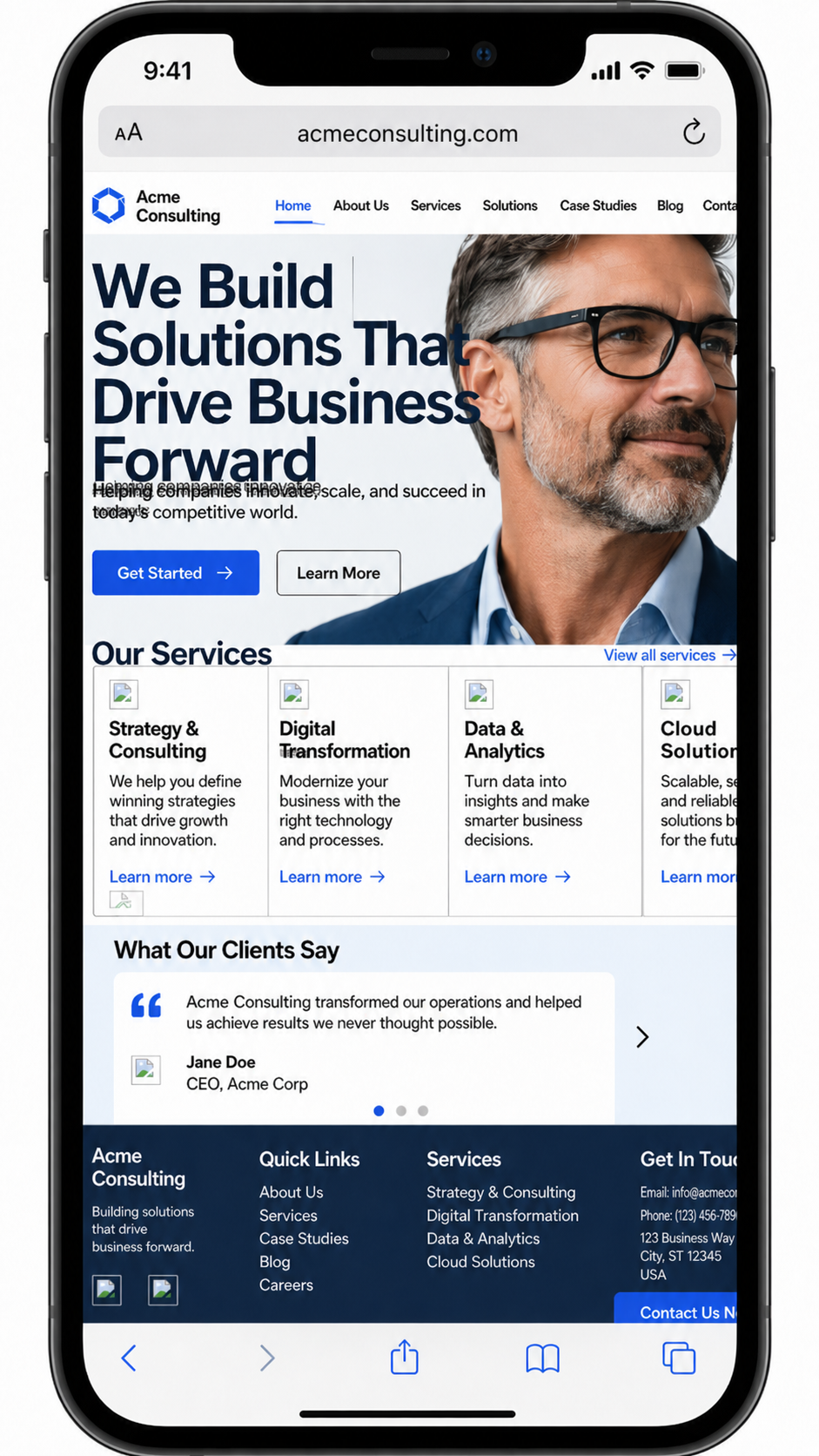
(Below) This mobile page would turn away customers because it feels broken before the visitor can make sense of it. The headline crashes into the image, the menu runs off the screen, text overlaps, and service cards are squeezed into a layout built for desktop. Instead of building confidence, the page makes the business look careless and hard to trust.
Long Inquiry Forms Kill Good Leads
Long forms can scare off good leads, especially before trust has been built.
People may not want to give a full address, budget, project details, phone number, timeline, referral source, and life story just to ask a first question. For service businesses, the form should match the stage of the relationship. Early interest needs a lower barrier.
Ask for name, preferred contact method, a short message, and maybe one useful qualifier. You can gather more details after the first response.
Ecommerce sites show the same pattern in a different setting. Baymard Institute’s checkout research has found that cart abandonment is tied to issues such as extra costs, slow delivery, lack of trust, forced account creation, long checkout flows, errors, and unclear total costs.
The same lesson applies beyond ecommerce. Every extra field is a small toll booth. Some are necessary. Too many make people turn around.
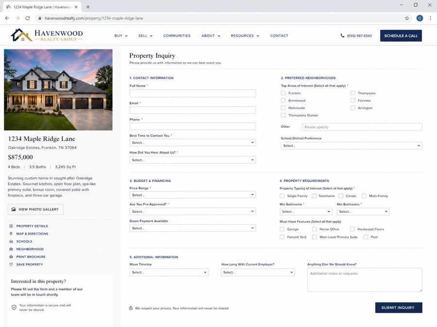
(Below) This form asks for too much before the visitor has enough trust to give it. Instead of making the next step feel easy, it turns a simple property inquiry into homework, with too many fields, dropdowns, and personal questions standing between interest and action.
Weak Calls to Action Leave Visitors Stranded
A website can explain the business well and still lose people if the call to action is weak, hidden, vague, or missing.
The visitor needs a clear next step. Call now. Schedule a consultation. Request a quote. Book an appointment. Check availability. Get a repair estimate. Start an order. Download the guide. Visit the showroom.
The call to action should fit the business and the visitor’s level of intent. Someone reading a legal service page may need a consultation button. Someone comparing HVAC repair companies may want a phone number, service area, and emergency availability. Someone browsing a SaaS product may need a demo button and pricing path.
Do not make the visitor wander to the footer like they are searching for a secret door.
A good call to action reduces hesitation. It tells people what happens next and makes the next step feel safe.
(Below) This page’s call to action is weak because it asks too little and promises even less. “Learn More” is generic, low-energy, and easy to ignore, especially on a page meant to sell phones, plans, and store services. Instead of giving shoppers a clear next step like “Shop Phones,” “Compare Plans,” or “Get Help Choosing a Phone,” it leaves them wandering, which can quietly cost the business inquiries and sales.
Practical Fixes for Faster Visitor Confidence
Start with the pages that bring in the most traffic or leads. For many businesses, that means the homepage, top service pages, contact page, booking page, and checkout or inquiry form.
Read each page like a stranger. Can the visitor understand the offer in five seconds? Does the page look credible? Does it work well on a phone? Is the next step obvious? Is the form short enough for the stage of trust?
Then fix the obvious leaks before chasing clever tactics.
Sharpen the headline. Replace vague copy with specific language. Add proof near the decision points. Repair broken images. Remove clutter. Shorten forms. Make buttons easier to tap. Put contact information where people expect it. Check analytics by device.
Most early exits are not mysterious. The website is too slow, too vague, too thin, too awkward, or too unclear about what to do next.
Visitors are busy. Business owners are busy too. The better website respects both sides by making the path clear, credible, and easy to follow.


0 Comments