
How to Create a Website Logo with Longevity In Mind
During the pre-production phase of every website project, a discussion arises about the company logo. Will the current logo integrate properly? Does the client even have a logo? Frequently, one question leads to another and it quickly becomes apparent the client needs a new logo.
If your organization is about to undertake a website refresh and a new logo is under consideration, the following tips will help you avoid common, and possibly expensive, mistakes.
How to Approach the Design of Your New Logo
Logos are unique graphical icons created to promote awareness of brands, products and organizational beliefs. Although there are endless options and no easy answers, don't get discouraged. Procuring a new logo activates a creative process that requires lead-time. If you perform your due diligence and pace the process, your company will end up with a logo that'll transcend the competition and stand the test of time.
These are the yardstick measurements of a great logo...
Multi-platform Ready
A logo design should nimbly re-purpose across different media; brochures, packaging, websites, fleet vehicles, products, billboards and clothing.
Company Ethos
The look and feel of a logo should reflect the attitudes, values and principles of the organization.
Represents an Industry
The logo should duly reflect the broader industry while possessing the ability to stand apart from direct competitors and other companies.
You Own the Logo
The rights of the logo should be the intellectual property of your organization. The designer should not have the legal ability to re-sell or license it to anyone else.
Avoid these common logo design pitfalls...
The following are design hazards to refrain from.
Trendy Logos
Design fads come and go. Two things happen when a trendy element is incorporated into a logo.
First, the logo will look cheap and second-rate. Customers will see the logo and have a déja vu experience, which makes them think of some other company.
Second, the logo will have a shortened lifespan. Sooner than later, the CEO will say the logo is no longer unique because 'everyone else has copied it' and will request another logo re-vamp.
Many logo design fads are easily recognized. For example, a common logo cliché is the 'Corporate Swoosh'. For many decision-makers, the swoosh is conservative and safe. It doesn't offend anyone. And, it comes in different colors and lengths. It's like Muzak for logos.
Examples of the "Corporate Swoosh"
This logo is too complex for digital marketing purposes.
Overly Complex Logos
What the heck is that?! When customers start asking some variation of that question, you know it's time to get a new logo. Highly ornate and complex logos may have been worthwhile during the Italian Renaissance; however, they're unwieldy in modern times. The ability to widely re-purpose a logo is a requisite; however, elaborate logos lack capacity to be re-purposed. They may pop on product packaging, but they'll flat-line for digital marketing - especially when viewed on a smartphone.
Using Stock Art Within a Logo
Using stock art within a logo is a common mistake with business owners who choose to design a logo on their own. The problem with using licensed stock art is that most stock licenses don't allow businesses to use the art within a logo. It's not a crime, but you may receive a 'Cease and Desist' letter or an unfavorable civil judgement if caught. This could make for an expensive situation.
And, a logo just isn't unique with stock graphics. When stock images are used, they're also used by many others across the business world.
Does this logo seem familiar?
“It is only by association with a product, a service, a business, or a corporation that a logo takes on any real meaning. If a company is second rate, the logo will eventually be perceived as second rate. It is foolhardy to believe that a logo will do its job immediately, before an audience has been properly conditioned.”
Logo Types Needed for Websites
We recommend having three different variations of the same logo available for web use.
The Landscape Logo
This logo-type should have a landscape ratio (where the width of the logo is at least twice the length as its height). This version of the logo is great for website use in the left-hand corner of the website header. In this position, the logo acts like a sign-post for website visitors. As visitors browse one webpage after another on your website, they'll be reassured with the logo in the header, that they haven't left your website.
The Icon Variant (spare the wordmark)
This logo should be a simple icon, perceptible at any size, large or small, and have a profile able to fit in a square or short-rectangular space. If there's any lettering, or wordmarks, no more than three characters should be incorporated. Why have this logo? This variation is great for mobile device displays. Many times, if the primary asset of a logo is a spelled-out wordmark (such as ' Ernst & Young' or 'Hewlett Packard'), a website will feel cluttered when browsed on a smartphone. An icon variant of a logo, or even a simplified logo revamp, can provide a clean look and have a positive impact on mobile browsing.
Break out your own smartphone. First, see how Ernst & Young's and Hewlett Packard's icon-like logos make mobile browsing easy on the eyes, http://www.ey.com/ and http://www.hp.com/. Then, compare and contrast the difference of the wordmark logos at The Vitamin Shoppe and American Airlines' mobile websites, https://www.vitaminshoppe.com/ and https://www.aa.com/. Even though it is slight, users will become fatigued with the spelled-out logotype. This fatigue will continue to build as a visitor spends more time on the mobile site.
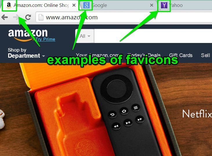
The Favicon
This may be the most difficult of the three web logo types to design. The favicon is a tiny logo that resides in very small places. What makes it so challenging to design is two-fold...
First, there are technical restrictions as a result of where it's being placed (i.e., browser tab). Specifically, Microsoft recommends the favicon have a 16x16, 32x32 or 48x48 pixel ratio for its browser.
And second, the look and feel of the primary logo needs to be recognizable in this puny graphic.
How Do World-Renowned Designers Approach Logo Design?
Over 40 years ago, designer Paul Rand created a versatile logo that has weathered the test time. This logo connotes the impressive advancement of technology while reminding us of the trustful reputation this corporate titan has built. This company and logo is IBM.
“Design can be art. Design can be aesthetics. Design is so simple, that's why it is so complicated.”
- Paul Rand, Designer of the IBM logo
Learn the back-story of this logo, about the man that thought it up and the amount of energy that was put into its creation. Watch this video.


0 Comments